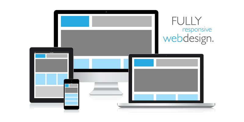
Mobile compatibility has become an integral part of the web design aesthetics. This has prompted both the designing as well as the development community to use responsive tools and frameworks for responsive HTML conversions. There are many leading mobile-ready frameworks available in the market place today which facilitate the conversion Photoshop designs into HTML. Here are the top 5 among them.
1) Responsive Grid System
This is a simple yet functional PSD to HTML conversion framework which aims at the instant development of responsive sites. The framework is specially designed to create mobile-ready websites and is available in 3 versions which are:
12 columns
16 columns
24 columns
Some distinctive features include a border-box, which enables the designers to add some unique render elements. The framework also has a clear-fix, which helps in box-sizing and clearing floats. The framework is quite light-weight with just 1 KB in size when compressed.
2) Titan Framework
The Titan is an ideal framework to target different kinds of mobile and tablet screens. The framework makes the website scalable to every screen the website is accessed on. You can create responsive layouts to adjust a website to any screen resolution by setting its maximum width. You can develop a responsive design within a few minutes, even if you are not good with coding. The framework is available in two versions for 16 and 12 columns.
3) Clank Mobile Framework
Clank is a highly preferred HTML and mobile compatible website frameworks. It specifically targets various mobile operating systems such as android and iOS. The framework uses Scss for faster development for mobile device compatible websites(even tablets). The Clank framework is majorly used for designing the operating systems of E-Commerce.
4) Gumby
The Gumby framework is aimed at making a stable platform for developers as well as users. At the same time, the creators of Gumby have made sure that the grid system syntax is similar to the one used by website developers. The latest Gumby 2 version is based on Sass, which makes it highly responsive.
Some other advanced features of Gumby mobile-ready HTML conversion framework includes:
Forms
Grids
Buttons
Enhanced Navigation
Labels
Toggle & Switches
Improved Tabs
HTML templates
Custom drop-downs
5) Responable
Responable is an innovative framework for grid based mobile optimized HTML conversions. The framework makes use of less and sass which enables in creating a highly responsive framework. The baseline grid comes pre incorporated into the CSS framework, making it simple for the designers to create mobile ready websites. Responable is ideal for quick and sharp website designing and is cost-effective.
