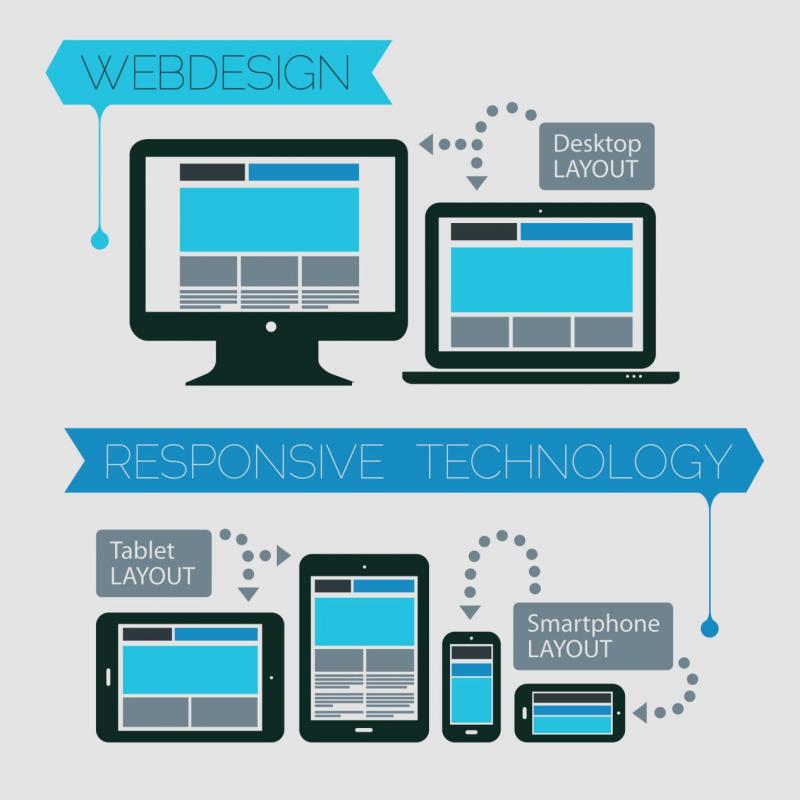
The advancement in the web designing and development today is focused on making the websites equally responsive over smartphones along with the desktops. A website needs to follow the necessary steps like PSD to HTML conversion or responsive web design to ensure that the website is able to reach out the maximum audience.
Responsive web design has become a mandatory approach, given the wide range of smartphones and other networking gadgets available today. This calls for developing a website which responds as per the behavior of the visitors. A website is accessed over a plethora of screen size, resolution and orientation. A responsive web design features a combination of images, grids, and CSS media queries for a scalable template.
1. Flexible Grids
Grids follow percentage values rather than the traditional pixels while a web template is designed. With the flexible grids, the web designer resize the elements of the mobile layout to each other. A flexible layout also ensures a relative resizing for both the container as well as its content and enables the text to be displayed effectively by moving other content at the bottom.
2. Media Queries
Media queries are implemented to a website when the syntax is being coded. It is widely used to set the conditions for a web design which adapt as per the screen size of the device.
3. Google Resizer
This is one of the common approach used by web developers to preview a website over multiple devices. The Google Resizer tests for the images to be easily viewed on a website. It is basically a tool to validate the responsiveness of the website. This is done by changing the web page dimensions. Since it is a browser based tool, there are predefined icons available for a developer to choose from.
4. Scalable Pictures
Flexible images are an important aspect when it comes to designing a responsive website. Features such as image scaling, appearance over different devices are to be considered while making the images flexible. The images are made scalable with the help of the percentage value to the width of the browser window.
You can feature image re-sizing with the help of the following code snippet:
<meta name=”viewport” content=”width=device-width; initial-scale=2.0″>
Conclusion
Creating responsive web designs is a profitable approach to feature engaging elements in your website and boost the sales metrics. It is important to ensure that you website design displays a responsive behavior. This accounts for an amazing experience and benefits the search engine rankings as well. Make your site responsive and explore new channels of organic traffic.
